N!ck’s Swedish Ice Cream
My Role: UX Designer
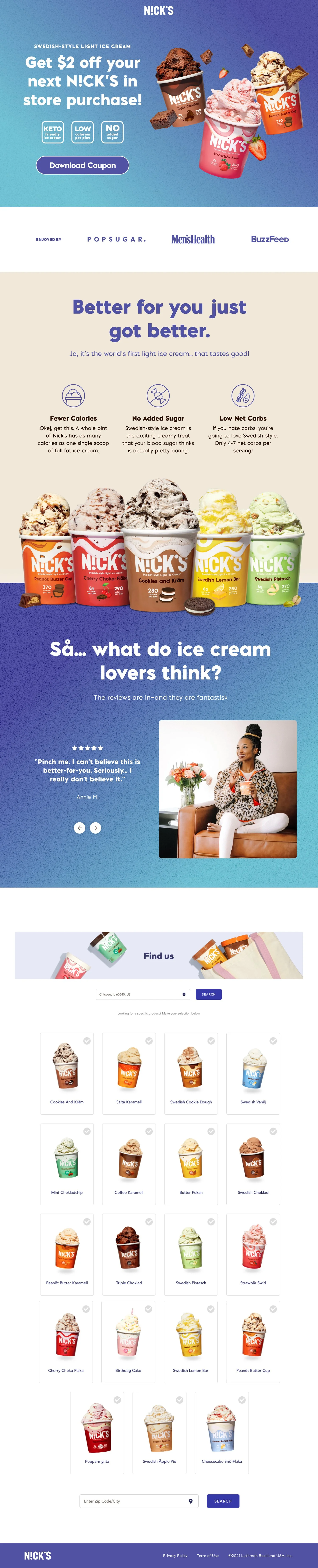
N!ck’s is a Swedish-style, low-fat, low-calorie, and keto-friendly ice cream sold at various grocery stores, including major chains like Albertsons, Safeway, Kroger, Ralphs, Target, and Walmart.
October 2020 – January 2021
UX Team
Focus
Client Webpage Redesign
Team
Timeline
The Problem
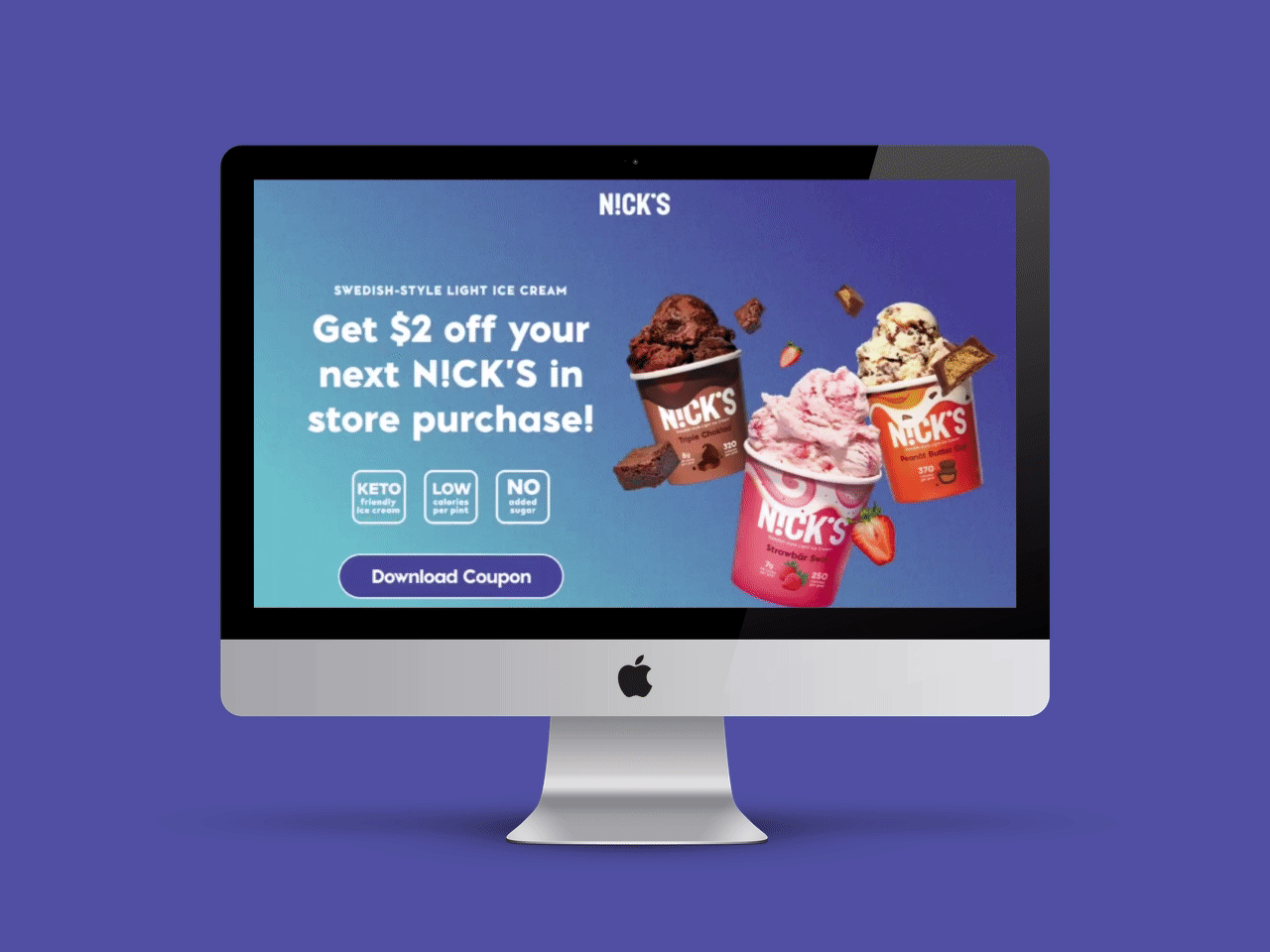
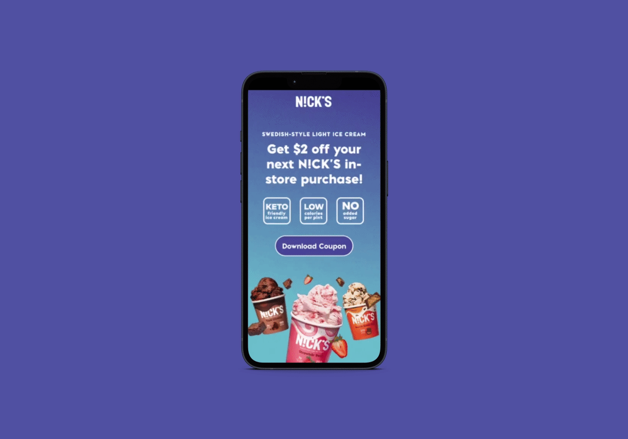
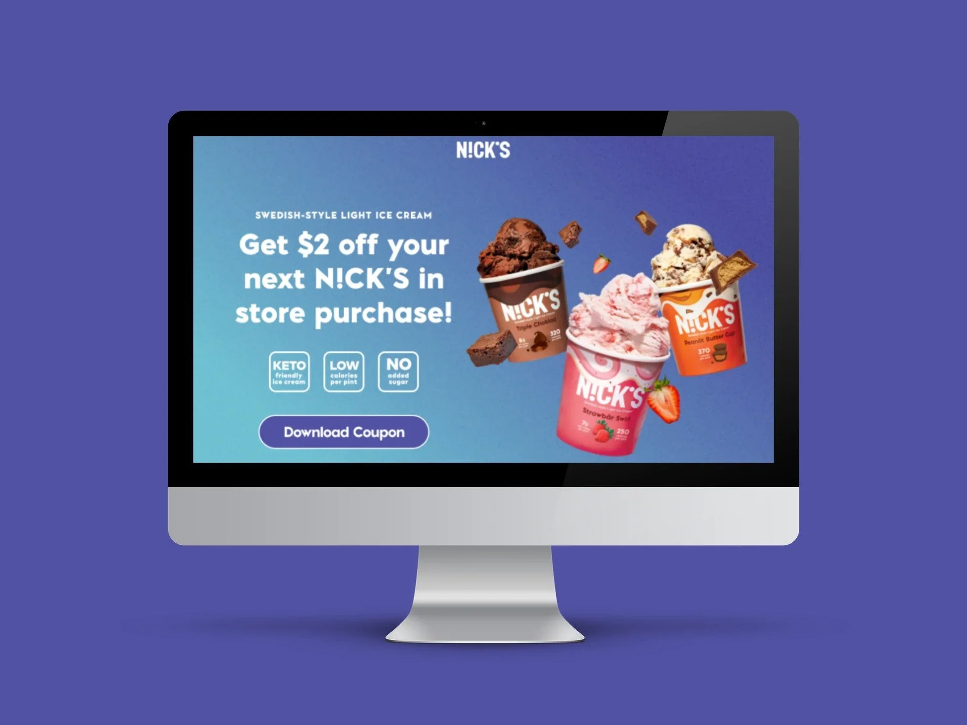
Improve the UX and visual simplicity of whitespace that focuses visitors on the main CTA
Rearrange text hierarchy to reduce back and forth reading
Update colors to reflect current brand colors.
The Solution
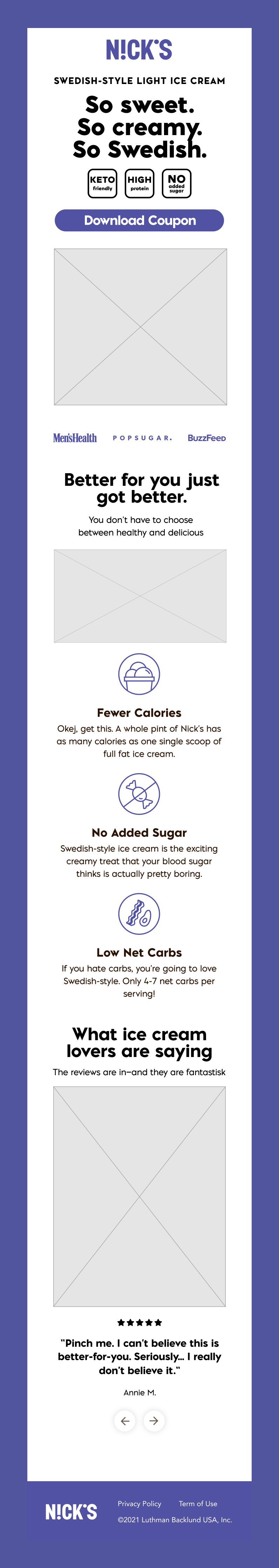
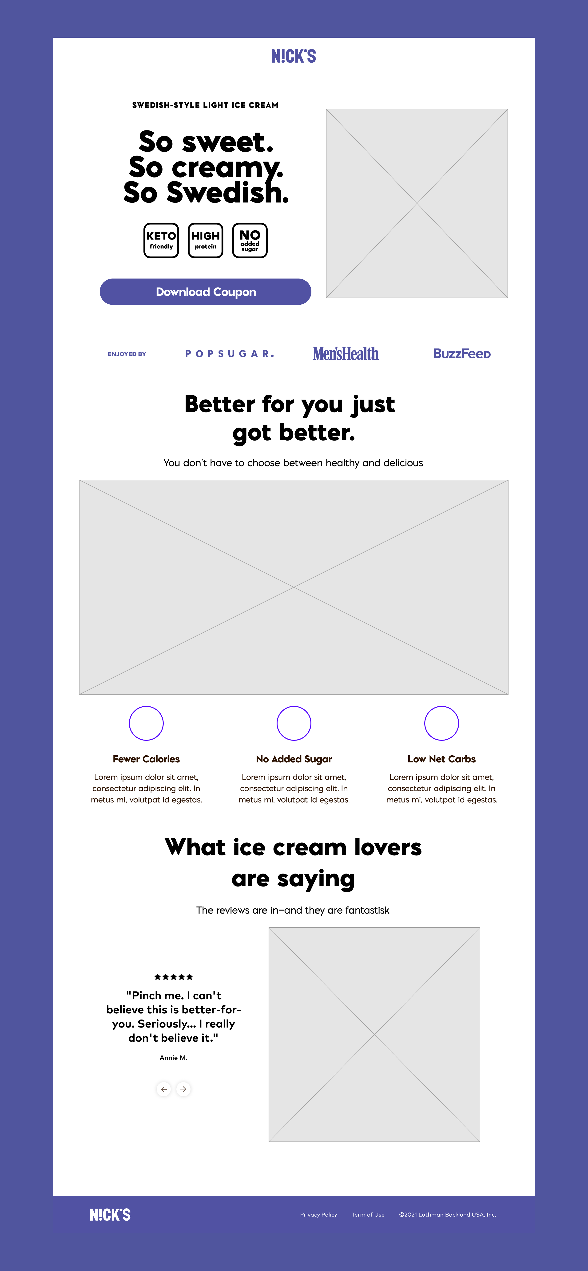
Implemented one headline as a “hook” to effectively engage visitors.
Made product name, N!ck’s, more prominent so users know which product to look for
Introduced branding on the landing page
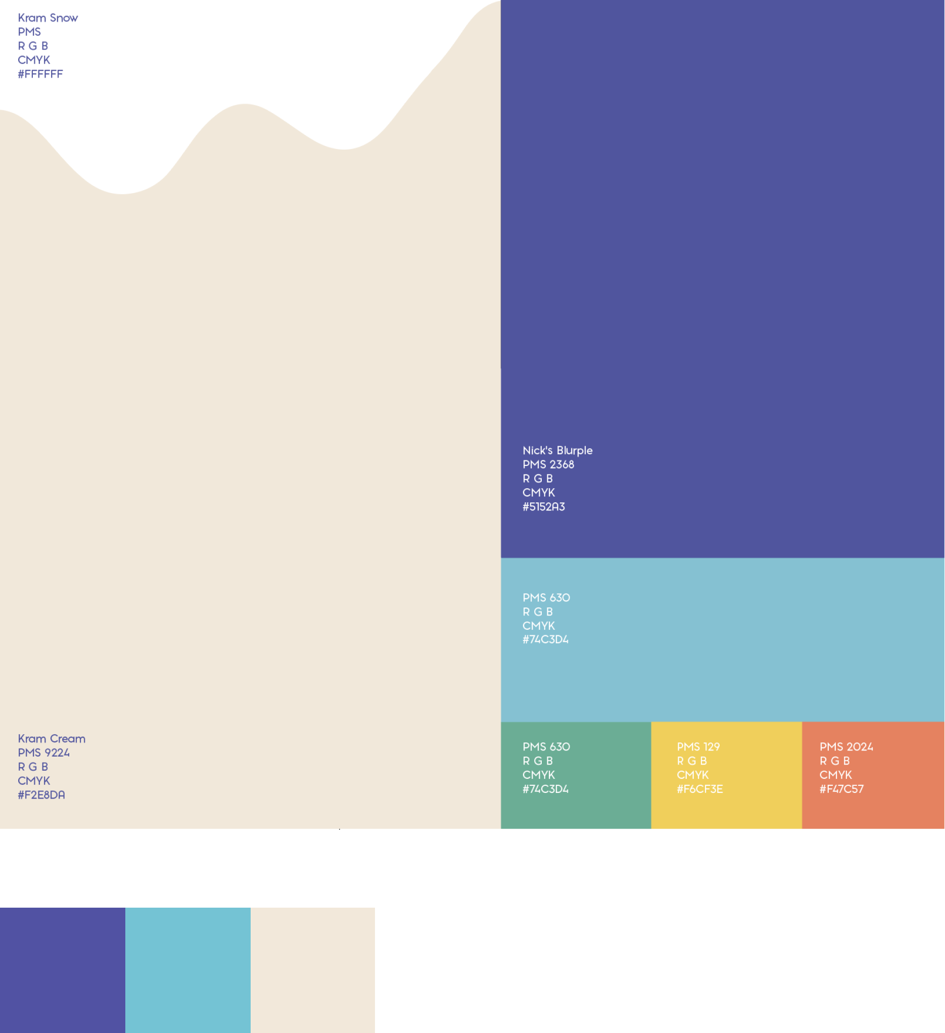
Updated colors to reflect current brand colors.
Key characteristics that help make a landing page look great and convert well
UX Simplicity

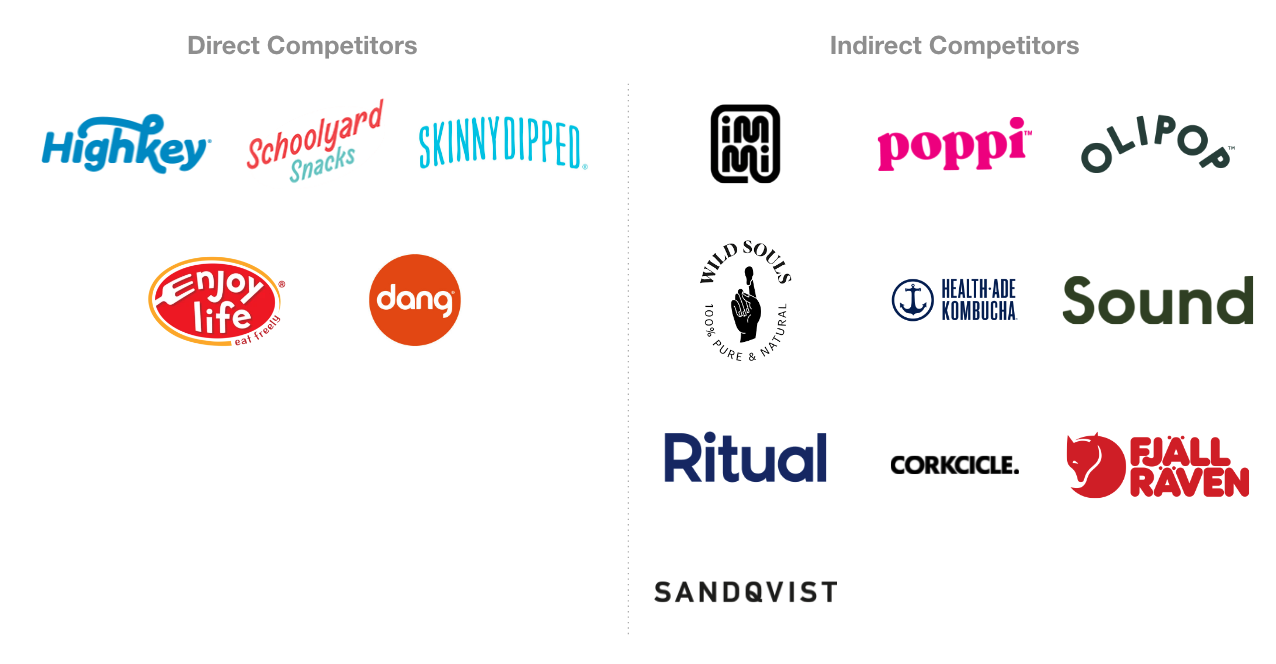
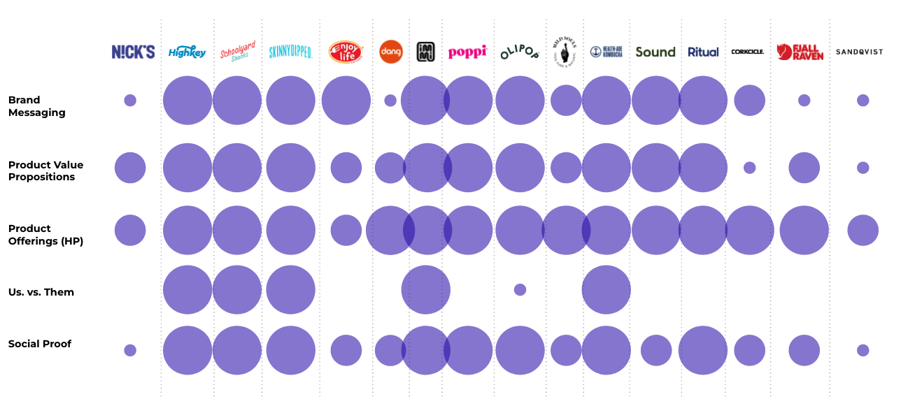
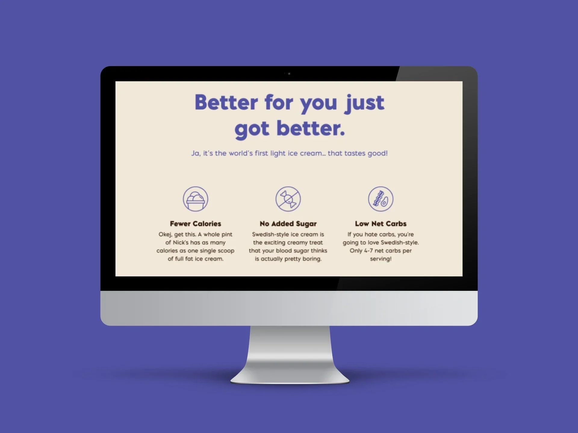
Introduced brand messaging with text/visual hierarchy of “hook” messaging to users why their product is unique and why they’re different from other brands in the industry
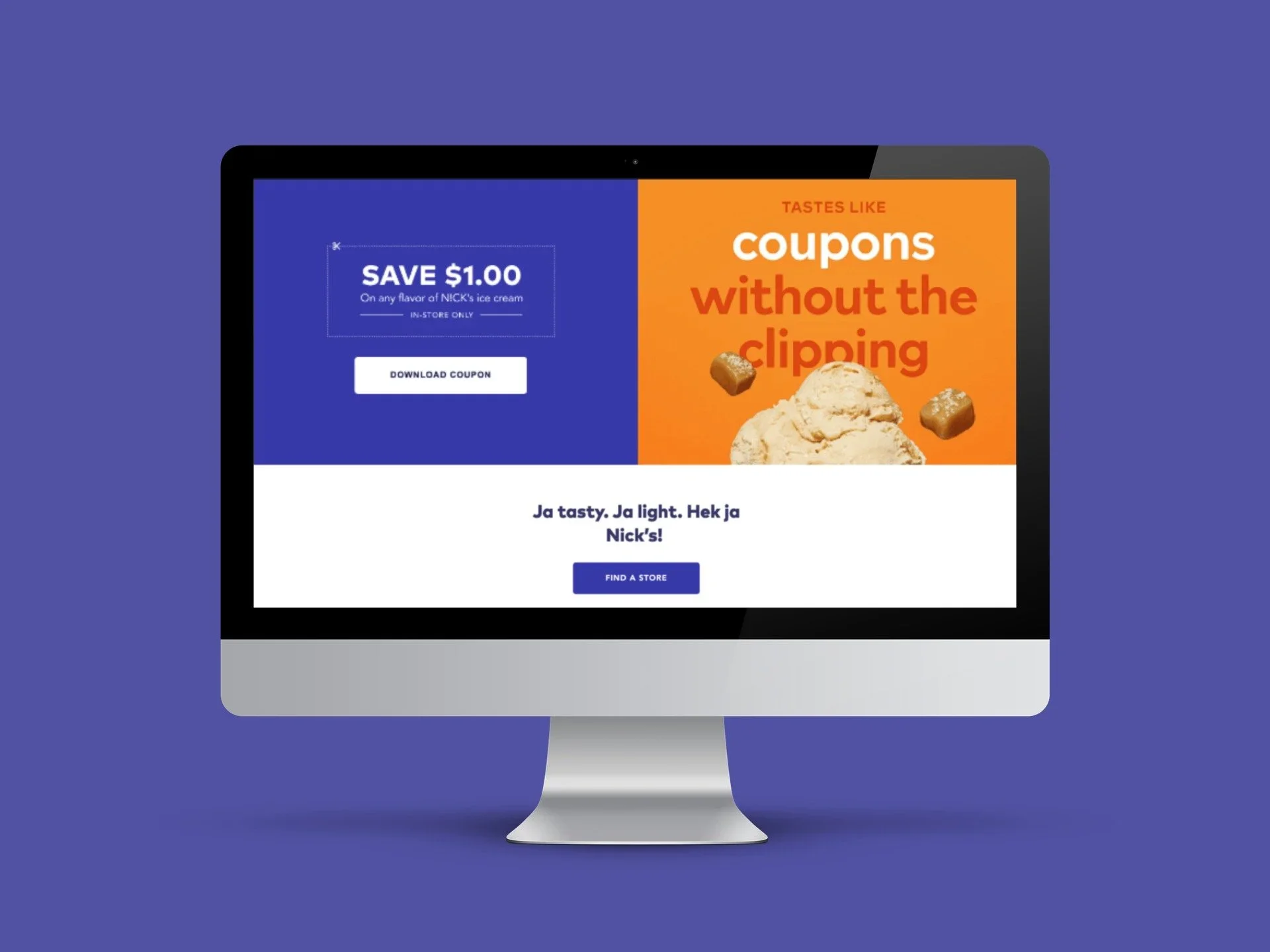
Showed a balance between very colorful packaging and imagery with simple and clean sections to attract attention
Included a mixture of products on a blank background and some in different environments
Displayed the coupon above the fold in the hero
Visual and Psychological Aspects
Used ingredient icons as texture for background or along with imagery
Considered animated imagery to engage and excite users
Used value props as icons to build trust with customers
Social Proof / Us vs. Them
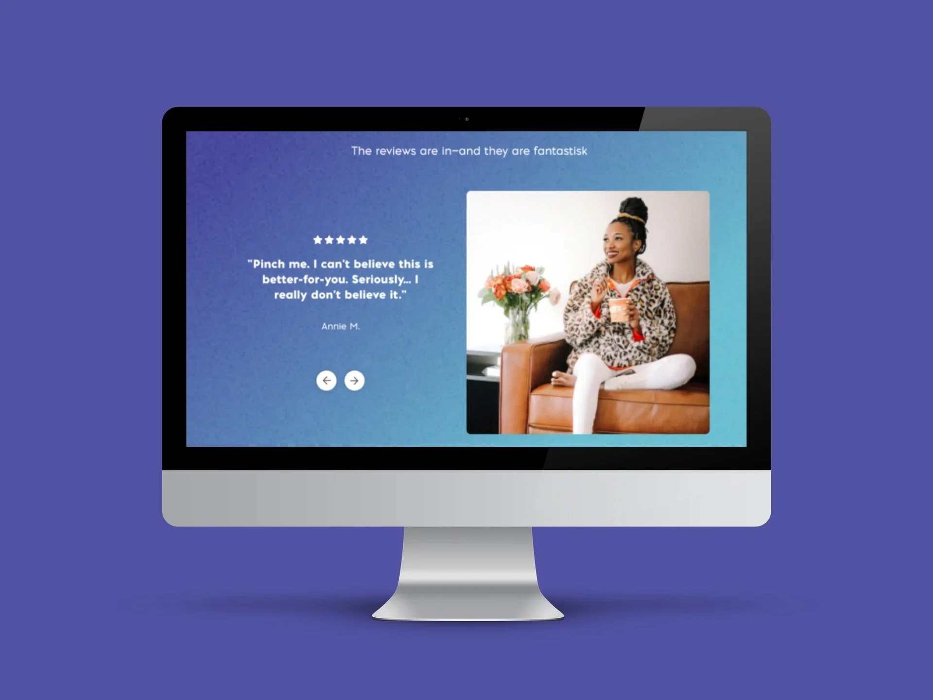
We conveyed a feeling of trust by displaying widgets like trust badges, ratings, awards, or reviews
Included short and sweet PR testimonials from real users to help users understand the product just under the foldo

Reflections & Learnings
If I were given more time to work on this project, I would participate in usability testing to test our research findings and theories to help eliminate any bias which would give me more opportunities to design a better user experience in the future!