Josephinum Academy Website Redesign
My Role: Senior UX Designer | Website Systems Redesign
Josephinum Academy is an independent, all-girls high school serving a diverse community of students, families, alumnae, and donors. The existing website had grown organically over time and no longer supported key user journeys or institutional goals. I led the end-to-end UX redesign to improve clarity, usability, and long-term scalability.
Timeline
Platform
Information Architecture, Interaction Design, Systems Thinking, Rebranding Strategy
CMS-based Institute Web Platform – Edlio
February 2025 – December 2025
Focus
Problem
As content expanded and priorities shifted, the website became increasingly difficult to navigate. Users struggled to find essential information, and the site structure reflected internal assumptions rather than user needs.
Key admissions, academics, and donor information was hard to locate
Navigation lacked clear hierarchy and consistency
Content duplication increased cognitive load
Internal teams lacked a maintainable system leading to out of date content
Overuse of the primary purple color
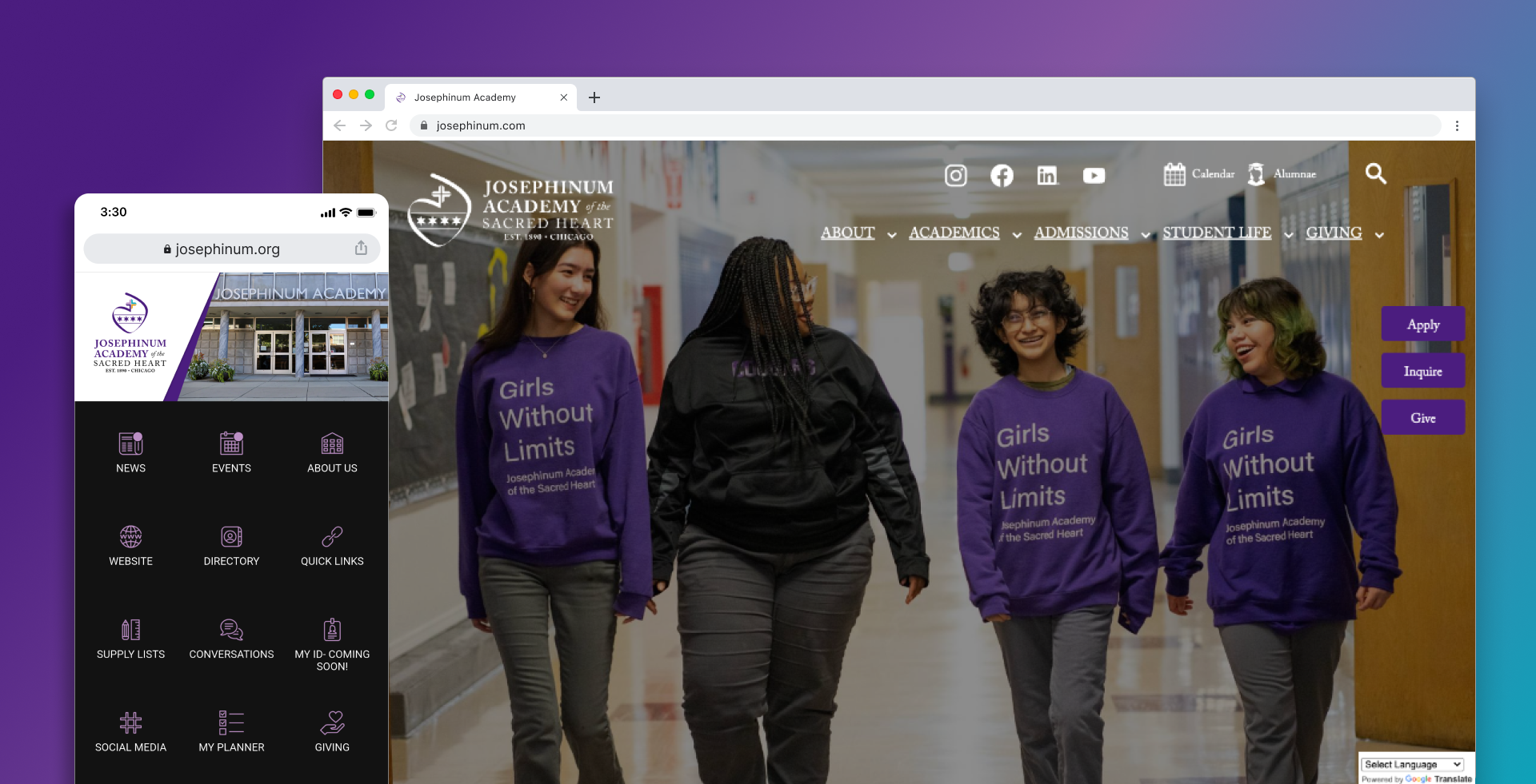
Before
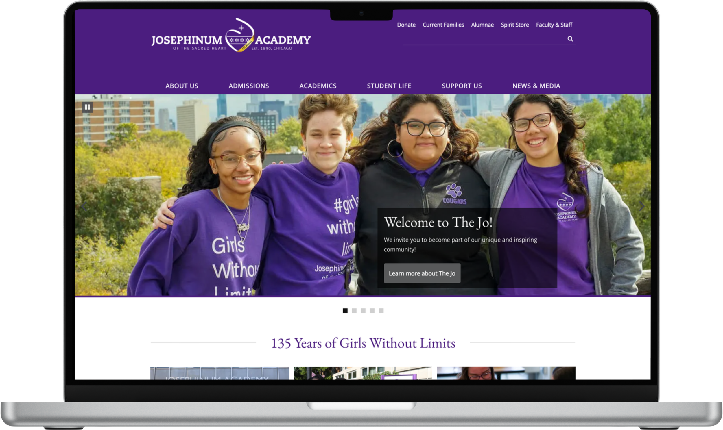
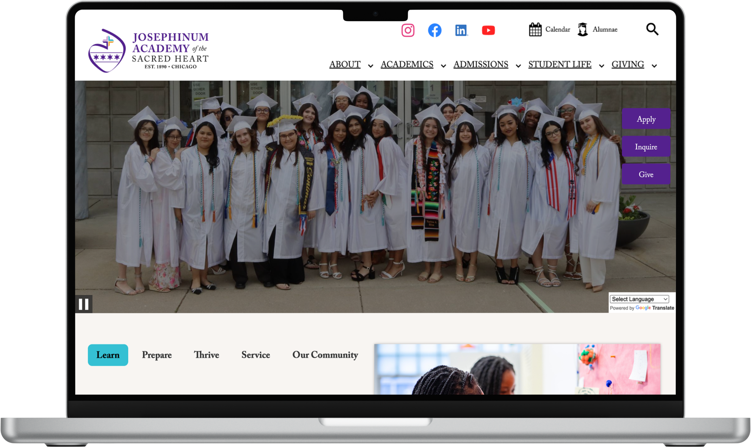
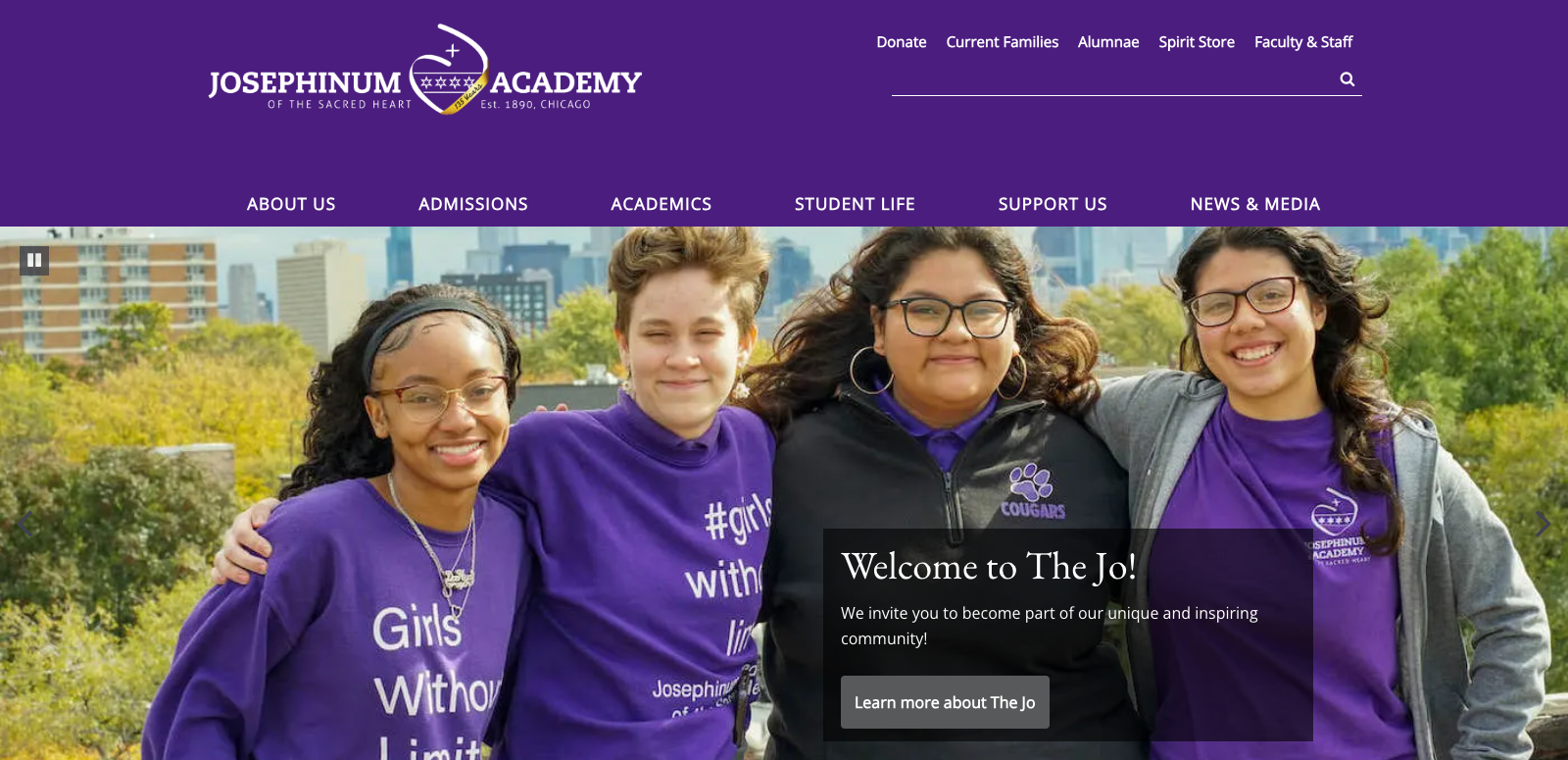
After
Solution
As a consultant, I spearheaded Josephinum Academy’s website transformation by leading UX research, information architecture, and brand/content strategy, alongside a full CMS migration from Finalsite to Edlio.
These design decisions lead to a major reduction of CMS costs, a more intuitive user navigation and experience, and the marketing team could manage updates in-house without developer support.
✅ 65% reduction in CMS costs
✅ Clearer Navigation and User Pathways
✅ Scalable System For Ongoing Updates
✅ Stronger alignment between mission and user experience
✅ Updated color palette, new logo, and improved contrast.
Before
Key information was difficult to find, text was small, not legible/accessible, and the primary purple dominated the page—creating visual noise and usability friction.
Important actions were buried, content was hard to maintain, and accessibility considerations were limited.
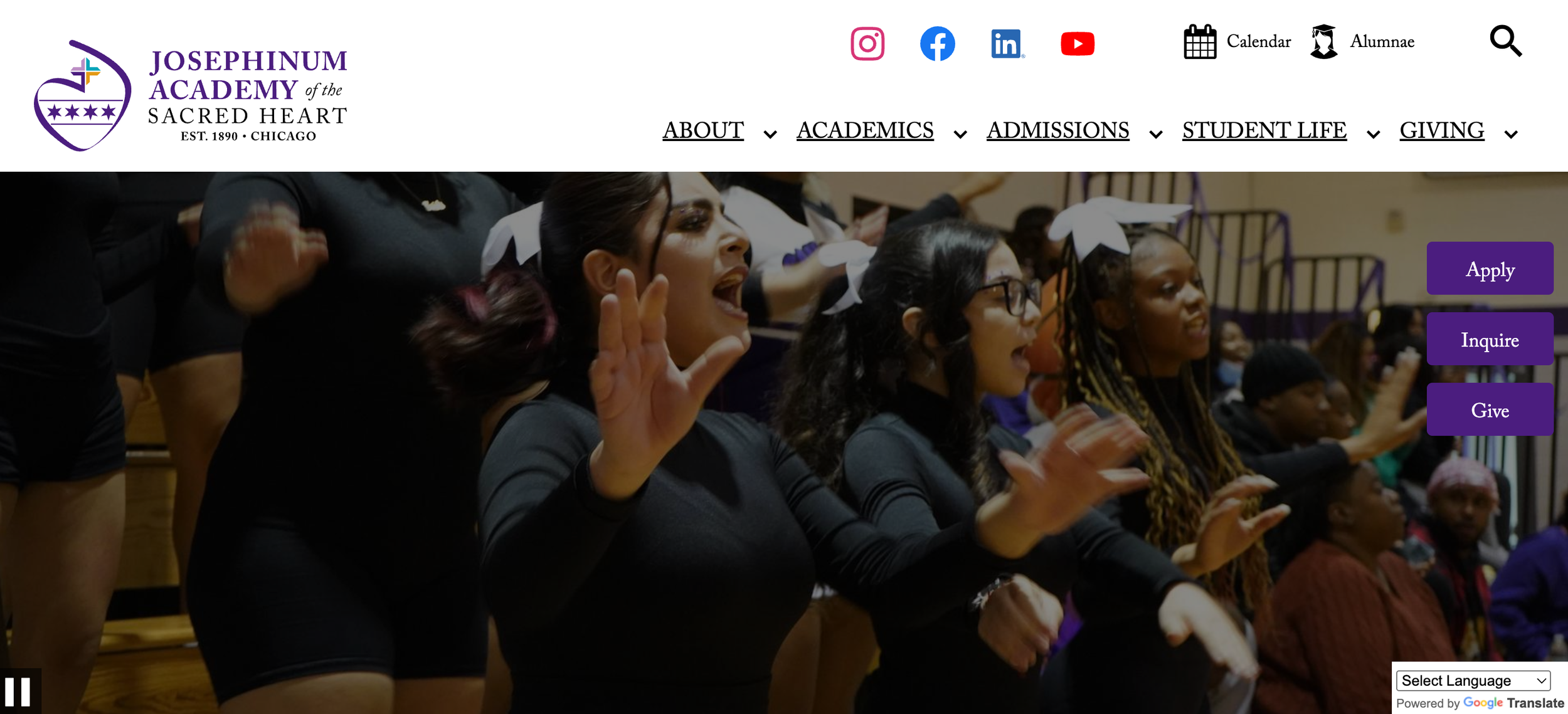
After
We simplified the navigation with improved hierarchy and refined the branding and logo to give be more accessible and visual, and to add visual interest and personality.
High-priority CTAs and tools are immediately accessible, navigation is clearer and more readable, and the new CMS platform supports faster updates without developer support.
My Role
As a consultant for Josephinum Academy, I owned the project from discovery through execution. I partnered closely with school leadership and cross-functional stakeholders to define the problem space, conduct discovery research, and deliver a scalable solution.
My Responsibilities
• Discovery & stakeholder alignment
• Information architecture & user flows
• User research & interviews
• Hi-Fidelity wireframes & interaction design
• Branding guide system & visual consistency
• Iteration through feedback & constraints
Scope
Multi-audience institutional website
Key areas: admissions, academics, giving
Content-heavy, mission-driven organization
Long-term scalability required
Constraints
Legacy site structure
CMS platform limitations
Multiple stakeholder priorities
Ongoing content updates
Discovery
I partnered with leadership, internal stakeholders, and the school community to understand the organizational goals, and existing challenges. I conducted discovery research and stakeholder interviews to identify the needs of prospective families, students, and alumni.
The site’s complexity stemmed from information dumping onto the platform and growth without a guiding structure.
Information architecture mapped in Google Sheets to align stakeholders and scale content.
Key Insights
Users scanned quickly and abandoned deep navigation paths
Terminology confused non-internal audiences
Content hierarchy did not match user mental models
Consistency and current info mattered more than completeness
The existing branding felt dated and no longer reflected the spirit of the school or its community.
Design Tradeoffs & Decisions
Balancing stakeholder needs, usability, and platform constraints required intentional tradeoffs. I facilitated conversations to align on clarity and long-term maintainability.
Prioritized top user tasks by audience
Simplified global navigation
Reduced depth and redundancy
Introduced a more affordable and intuitive platform for scalability
Modernized the branding and color palette
Visual System (Supporting)
Once the structure and interactions were defined, I refreshed the visual system to support clarity, accessibility, and consistency.
Updates
Modernized color palette with improved contrast
Refined typography and spacing
Unified logo system (seal, anniversary, internal)
Comprehensive brand guideline delivery
4 Key Outcomes & Results
65% reduction in CMS costs
100% Clearer Navigation
and User Pathways
Scalable System For Ongoing Updates
100% Stronger Alignment Between
Mission and Experience
Key Takeaways
Clear information architecture reduces both user friction and internal maintenance overhead
Designing around user mental models creates alignment across stakeholders
Early discovery and shared definitions prevent costly rework later
Scalable systems are more valuable than one-time solutions
Reflections & Learnings
This project reinforced the importance of designing for clarity over completeness. In complex, mission-driven environments, structure and prioritization matter more than adding features or content.
How I’d Approach This Next Time
In future iterations, I would incorporate earlier usability testing on navigation concepts to validate assumptions before moving into high-fidelity design.