Ambrosia Food for Thought Website Redesign
Role: UX Designer | Website Redesign
Ambrosia Food for Thought is a woman-owned holistic wellness brand offering plant-based products, educational resources, and community workshops. As the brand expanded and its products became available through national retail channels, the existing website no longer reflected the credibility, clarity, or trust required to support growth.
Timeline
Team
March 2021 - May 2021
3 Designers + 1 Developer
Focus
Client Website & Visual Identity Redesign
Problem
The existing website made it difficult for users to understand the products, navigate educational content, or confidently take action. The experience lacked structure, resulting in friction for both customers and the founder managing the site.
Business Goals
Overcome advertising challenges to effectively reach and engage the target audience
Foster trust and loyalty by building lasting client relationships
Develop E-commerce store through her website
Target Audience
Individuals seeking holistic health solutions and alternative medicines to address the root causes of their health concerns. These are people who value personalized care, want noticeable results quickly, and prioritize trust and compassion in their health and wellness journey.
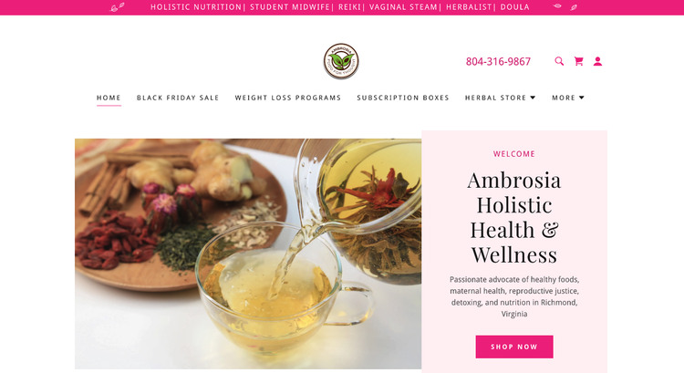
Before
Key Challenges
Navigation and content hierarchy made it hard to shop or learn
Product value and usage were unclear to new customers
The visual system did not reflect the brand’s growing professionalism
My Role
I worked as a UX Designer on a small cross-functional team to redesign Ambrosia’s website with a focus on clearer user journeys, improved information architecture, and a scalable system that balanced education, commerce, and storytelling.
MY RESPONSIBILITIES
• UX research and site audit
• Information architecture and site maps
• Wireframes & interaction design
• Collaboration with development for CMS-ready solutions
Define
We conducted an in-depth interview with our client to understand her background, brand identity, and entrepreneurial goals. This insight guided us in crafting a personalized brand strategy for Ambrosia.

Scope
Full website redesign
Product discovery and education flows
Founder storytelling and brand trust
Mobile-first, accessible design
Constraints
CMS and GoDaddy platform requirements
Limited client technical resources post-launch
Need to balance education with conversion
Small team and tight delivery timeline
Competitive Analysis
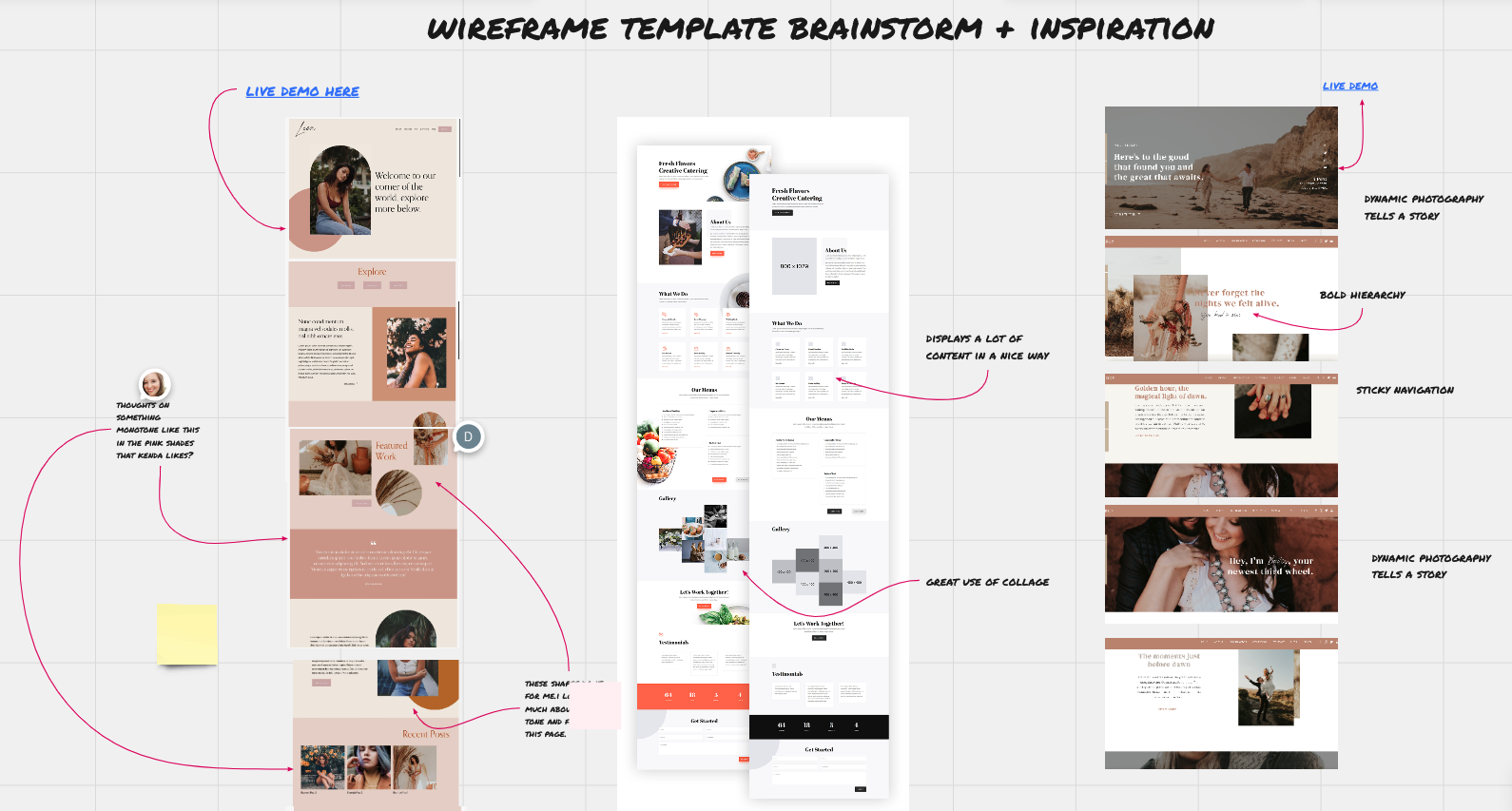
We did a competitive analysis to understand our niche and market. We also wanted an enhanced vision of what users appreciate regarding style, fonts, and visual designs.
Our website adds value because it allows you to easily see and shop for popular products & services that match your wellness preferences.
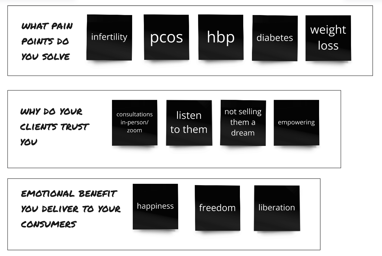
User Surveys & Interviews
Our screener survey and card sort gave us information about users' lifestyles and mental models so we could design and develop a wellness website solution to make targeted improvements.
Behavioral and attitudinal data were gathered about users by listening to their thoughts and feelings via Maze and Zoom.
The information we found from our survey and card sort allowed us to iterate on vocabulary, information hierarchy, and branding style.
Key Discovery & Insights
New users needed clearer guidance on where to start
Product education was essential for building trust
Founder storytelling was a differentiator but underutilized
Simplified structure would reduce cognitive load and support conversion
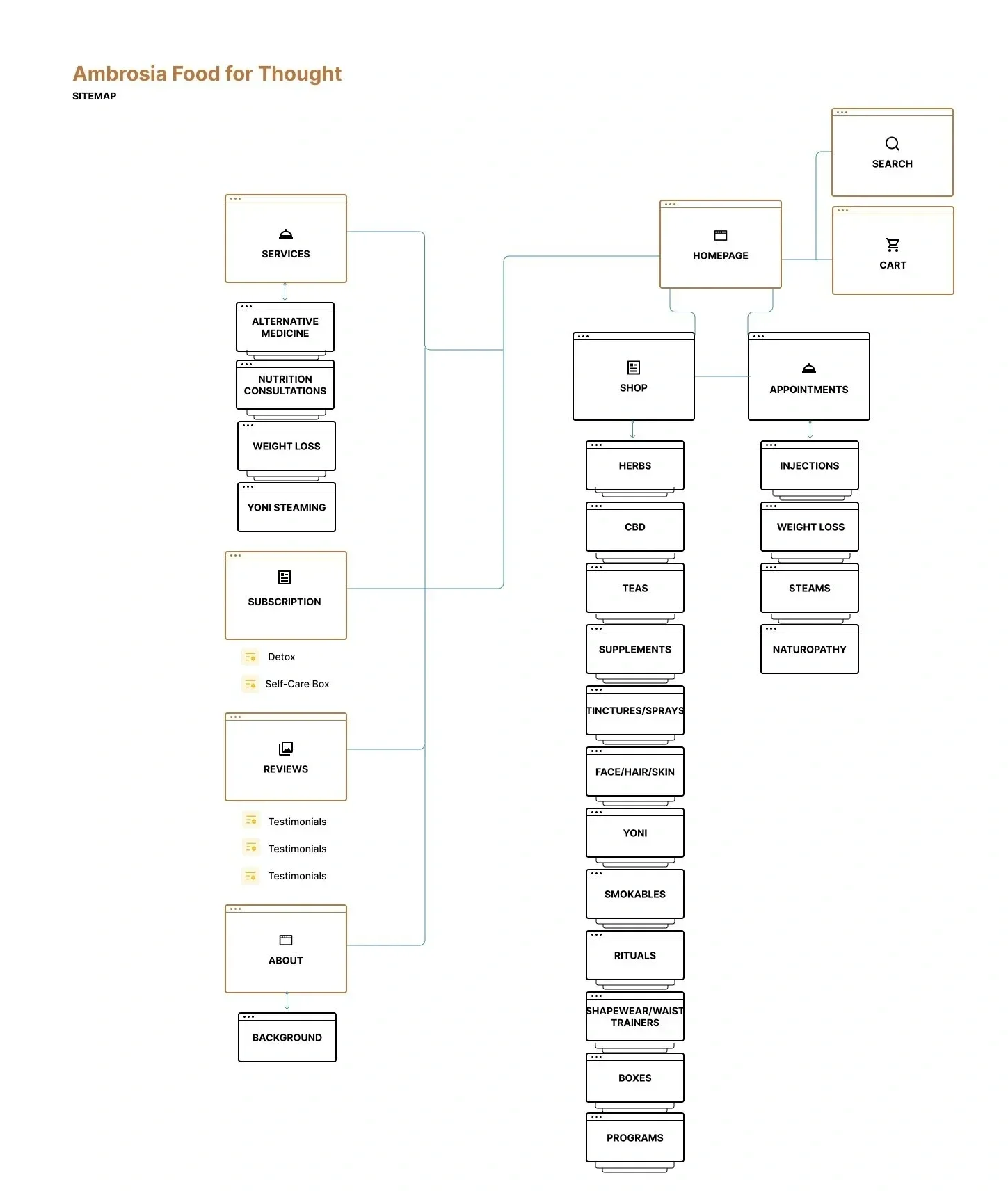
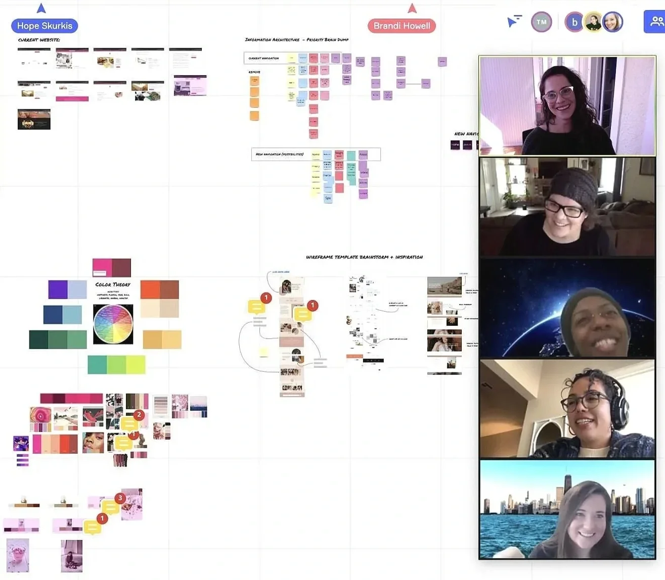
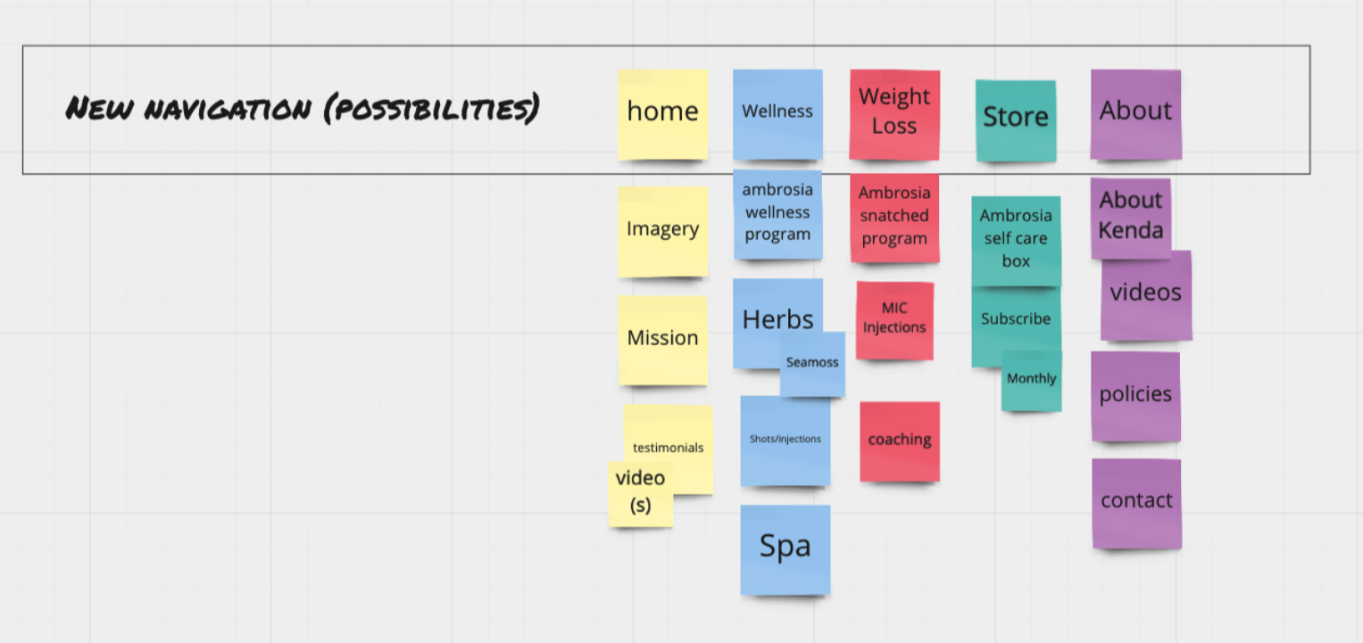
Sitemap
A site map was used as a basis for the navigation structure around the information architecture. We thought about how users would move between sections and features of the website. Reorganizing the information in the navigation menu was the biggest challenge.
We checked in with our client to see which areas were high priority and which products were top sellers.
Information Architecture & Interaction Design
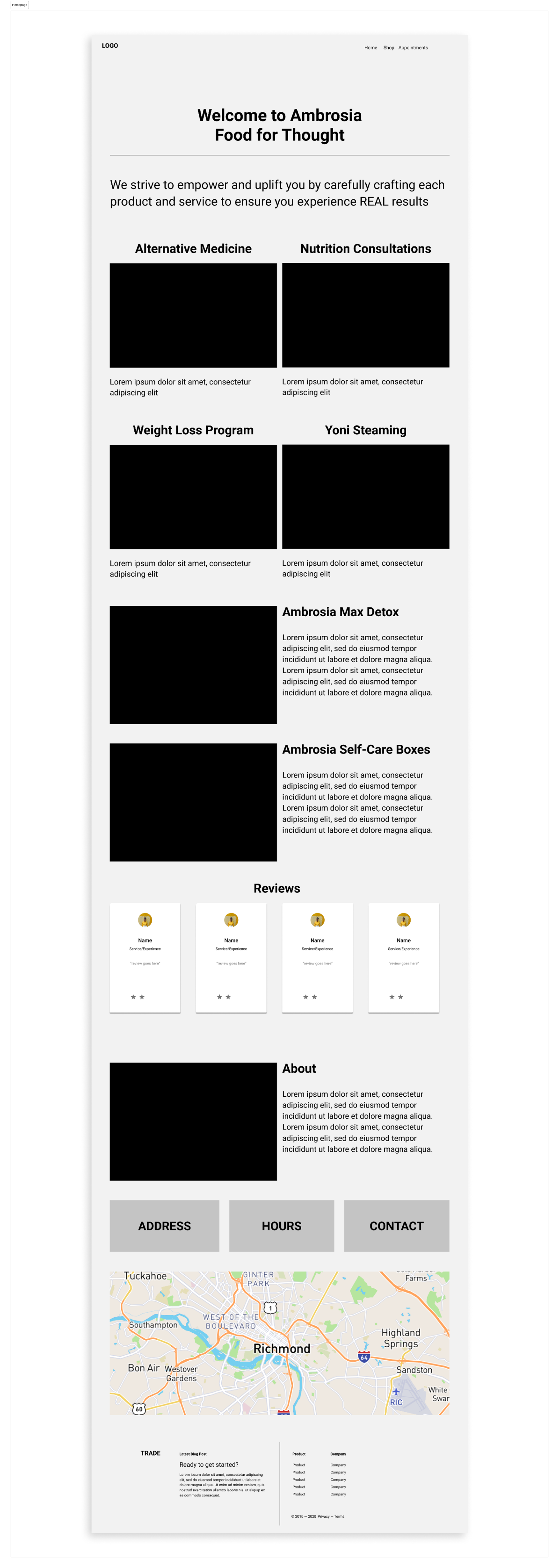
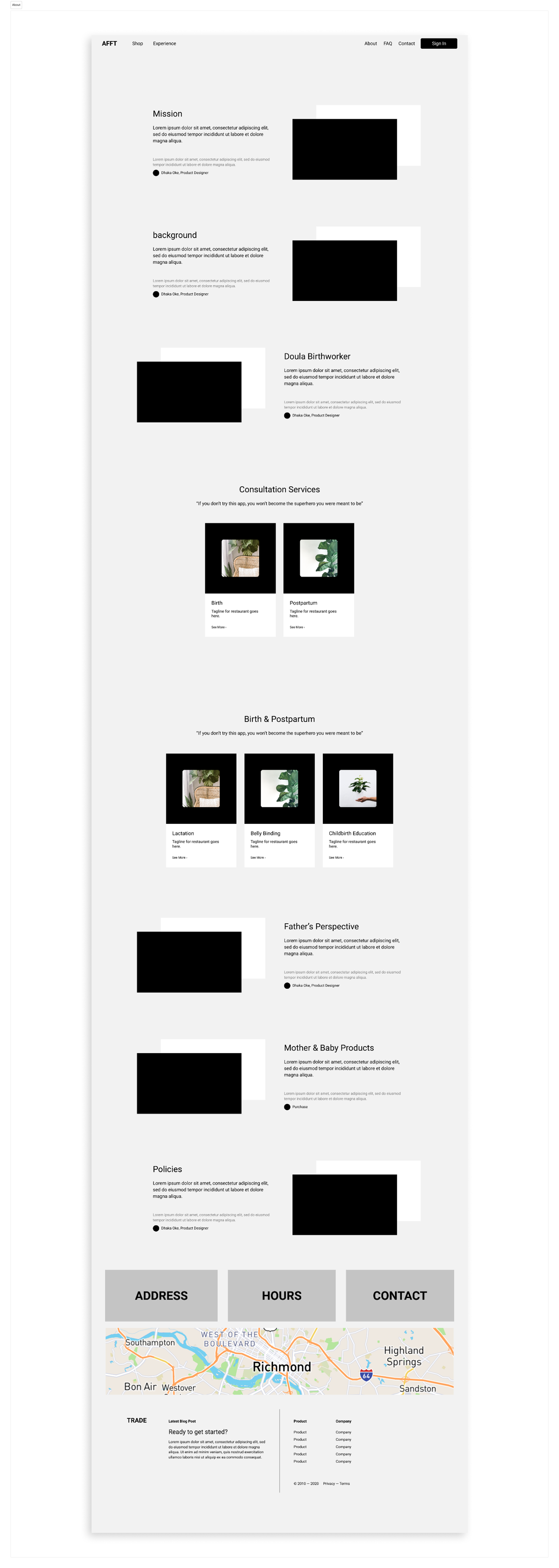
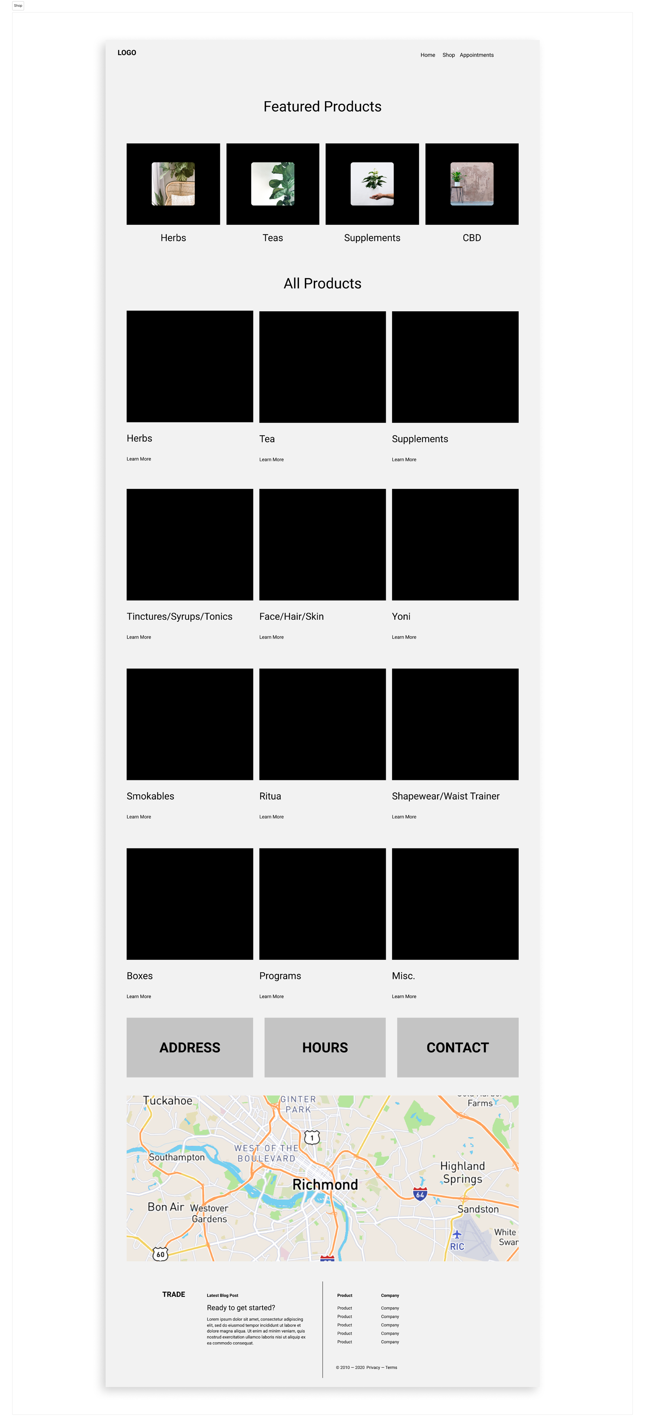
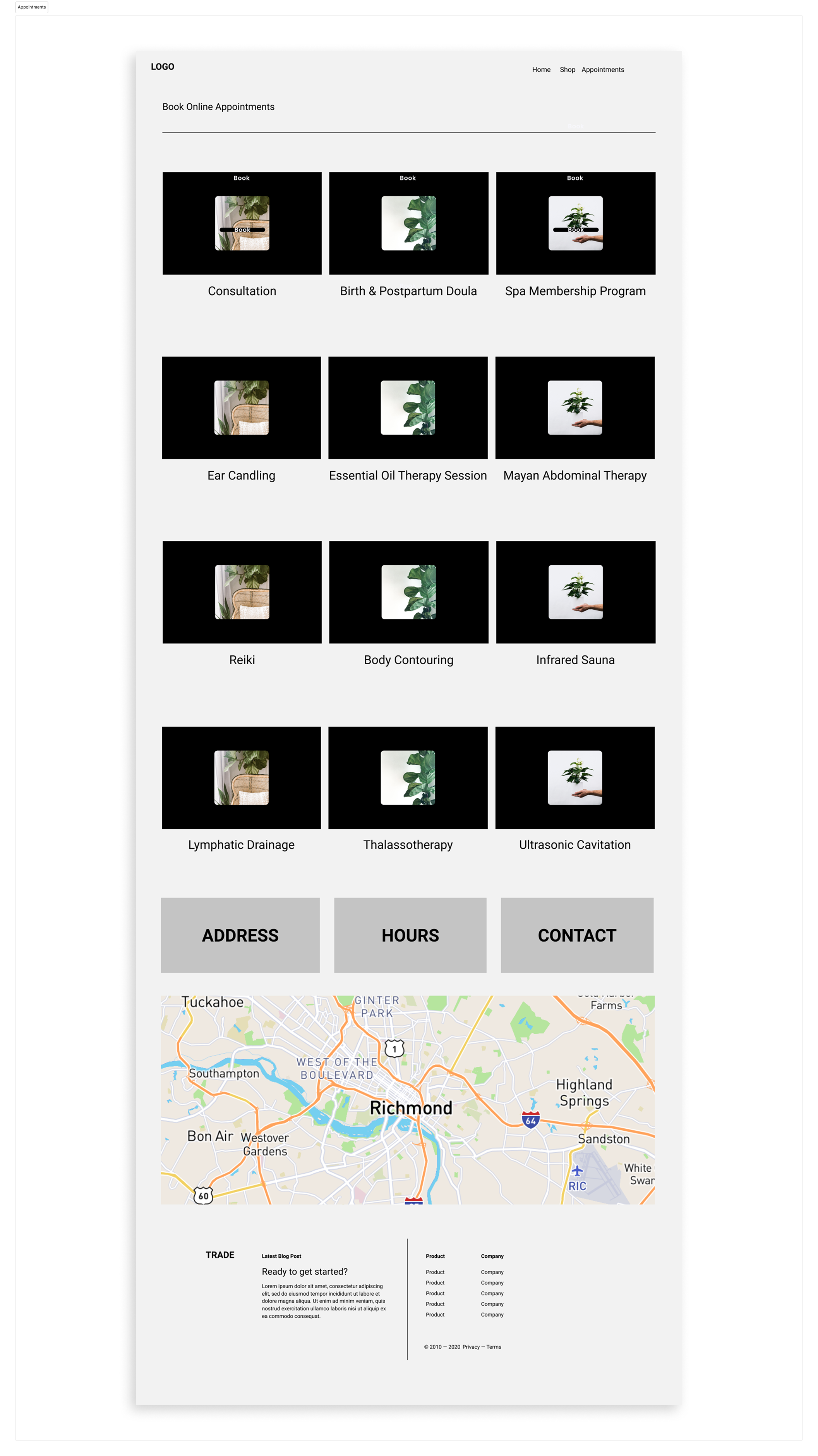
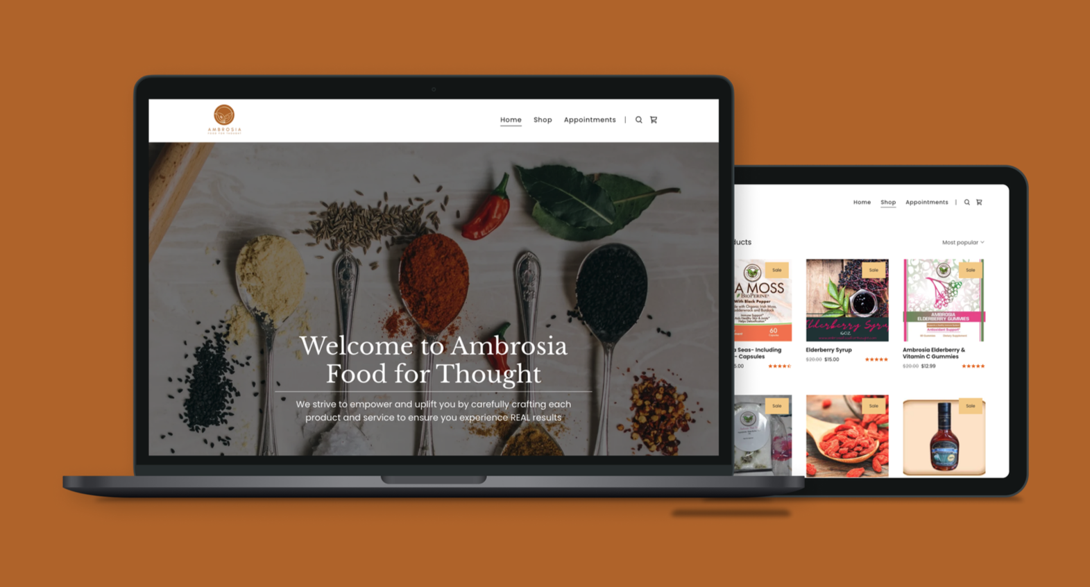
Based on discovery, we reorganized the site around clear, task-oriented user journeys rather than content type alone. The goal was to make learning, shopping, and brand connection intuitive and predictable.
Key Design Decisions
Reorganized navigation into three primary pillars: Shop, Learn, and About
Designed product pages that paired education with clear calls to action
Created repeatable templates for content scalability
Prioritized mobile usability and scannability across pages
Key Tradeoffs
Streamlined educational content to improve clarity
Simplified visual treatments to support readability
Designed flexible components within CMS constraints
Balancing brand storytelling with usability required intentional tradeoffs. We reduced content density and simplified layouts to help users move confidently through the experience. Designs were iterated through team critique, client feedback, and developer collaboration to ensure feasibility and long-term sustainability.

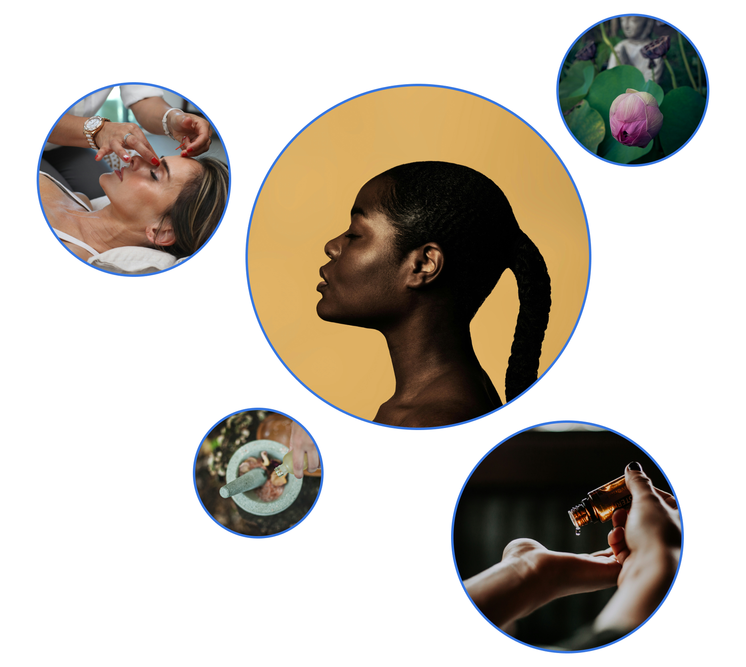
Visual System (Supporting)
Once structure and interaction patterns were established, we applied a refreshed visual system that reinforced warmth, trust, and clarity.
Highlights
Warm neutral palette with improved contrast and accessibility
Soft typography and generous spacing for readability
Consistent components across product, education, and brand pages
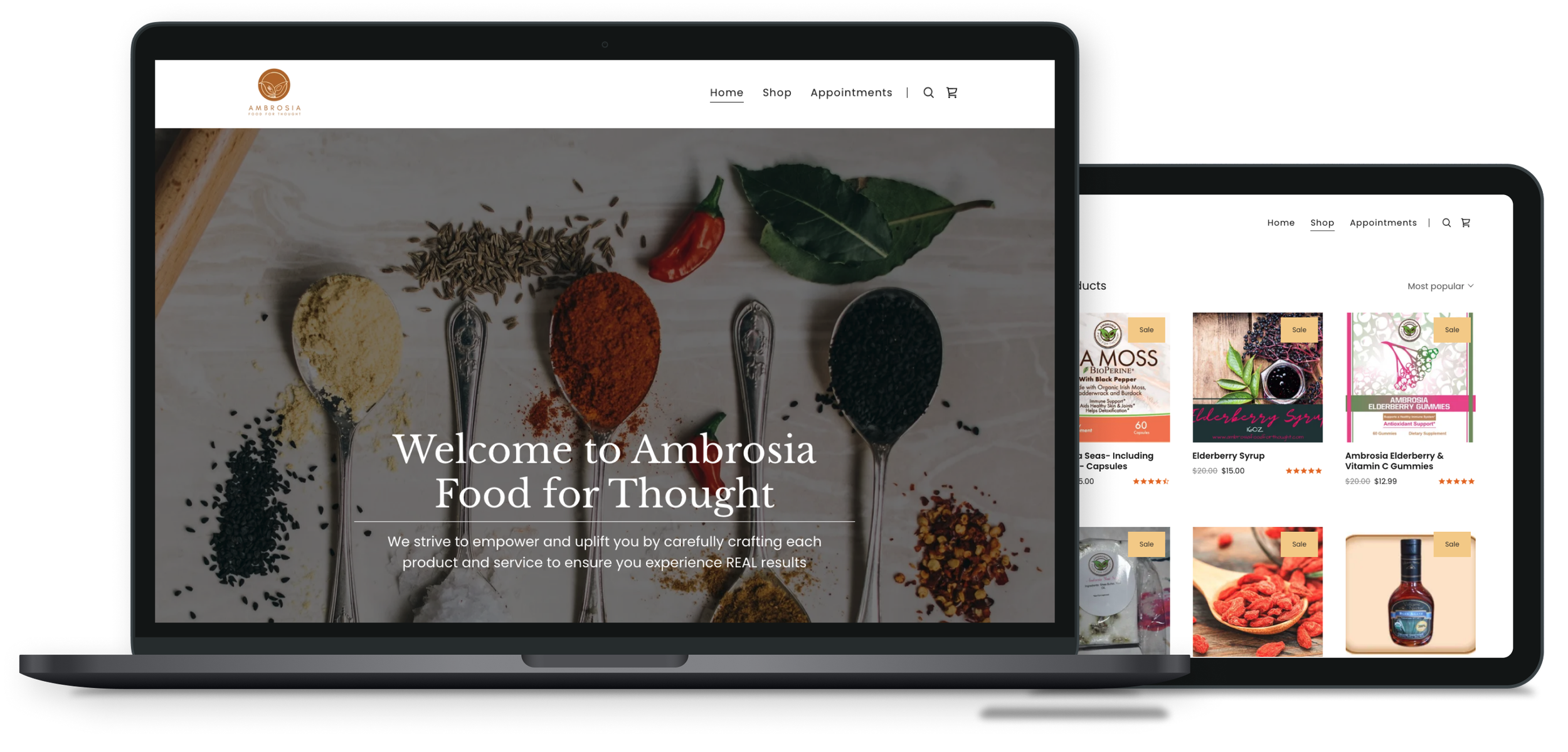
4 Key Outcomes & Results
Clearer paths for product discovery
and wellness education
Improved usability and visual hierarchy across the site
Client successfully managing content post-launch without developer support
Stronger digital foundation supporting national retail growth
Reflections & Learnings
This project reinforced the importance of designing structure before aesthetics. Clear information architecture made it easier for users to learn, trust, and engage, while also empowering the client to manage and grow the platform independently.
Key Takeaways
Educational clarity builds trust, especially in wellness and health-adjacent products
Scalable systems create value for both users and internal teams